43221 Queen Elizabeth Sixth Form College

Tuesday, 14 December 2010

Using Brushes

(Un-edited photos that I decided to practice some new brushes on)
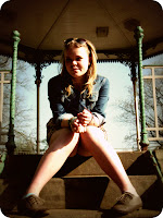
Origional photo taken in the summer, I decided that the colours and the 'feel' of the photo didn't really reflect the vintage style of the clothes and the pose of the model.
 Therefore I edited the photo, so that the colours reflected the warm oranges of the day, and also the grainey textures etc that are related to the vintage style. I felt that the photo was still too digital/modern looking to fully represent the vintage feel that I was hoping for. 
So I downloaded some 'grunge and dirty' brushes, and used them around the outsides of the photo to give it the distressed/tired look- which further helped me to achieve the 'older' style of the photo, and also makes it more interesting than the usual rectangular borders of photos. The brushes I used help to add character. 

Wednesday, 1 December 2010

Snow Photos (Landscapes and Macro)

 I like how in this photo the eye travels along the line of the trees, because they are all level with eachother and stretch out into the distance it gives the photo depth.
 Low angle photo with a foreground (bench), middle ground (lightposts) and background (trees).
 I used zoom, manual focus and the 'macro' setting on the dial to take this picture- I love the detail of the snow and the bark.
 Shutter speed 1/4000, it's a fun photo and I enjoyed taking it.
 I loved how the sky was so pale and how a gap in the trees branches looked like a love-heart, the branches make a great and interesting frame for the photo.
 The graffiti on the tree really contrasted with the surroundings, because the colour stood out from the white snow and black benches/lamposts.
 Again I used zoom, manual focus and 'macro', this photo has brilliant detail and defenition of the leaves and icy droplets of snow. I also like how the front leaves stand out from the background leaves because they are in focus and the background's out of focus- it gives them more importance.
 Same as before; zoom, manual focus and 'macro'. I love this photo. The detail is lovely.
 Zoom, manual focus and 'macro'. I like how the spiky sharpness of the branches reflects the sharpness/cold connotations of the snow. Although it's a shame that there was some melted snow on the camera lens- so there's a splodge in the middle of the photo.
 Shame about the snow on the lens, but I like the low angle- which makes the building look larger than it is and very powerful in the photo.
I liked the light behind the trees, and how is casted a pinky tint over the stray branches of the trees in the sky. A classic wintery style photo.

Sunday, 21 November 2010

Lighting

Side Lighting and Front Lighting:

Side Lighting- is good for pictures where capturing texture is important; by lighting your subjects from different angles you can get shadows to fall across them in different ways. It is particularly important with black-and- white photography because it relies on grey tones rather than colour, therefore by using side lighting you can achieve a more 3-D photo that has more depth to it because the side lighting has cast shadows across the surface and revealed tiny details and textures that would've been lost without artificially casting shadows on the object.
Front Lighting- gives your subjects a flattened effect, because the light doesn't bring out any depth in the image, this is a really good type of lighting for beauty/face shots because it gives a flawless appearace. (But because front lighting creates a flattened effect it is bad for bringing out detail in an image, it is better to light your subject from a slight angle to show slight details in your image). 


Connotations of Side Lighting:

Side lighting can be used to bring out the detail in a photo, and also it can be used to create light and darkness in one shot. If your source of light is coming from the left hand side and falling onto your subject, then the right hand side will fall into the shadow cast by the left hand side. Therefore you can use side lighting to create light and dark in a single shot and highlight certain parts of your subject- this can be used cleverly to show good/bad or hint at emotions of the subject such as them having a "dark-side".

Lighting on Human Features:

Side Lighting on Males:
Side lighting can be used to accentuate male features because it creates depth in the image, the light coming from the side picks out their bone structure such as cheekbones and their jawline and makes them more refined. Side lighting also creates the effect of long shadows and bright, washed out areas, which creates strict contrasts on a face- which shows manly ruggedness.


Front Lighting on Females:
Front lighting works well on female features because it is soft and diffused, this is more flattering on a face and it is also good for softening wrinkles and imperfections under a smooth and even illumination.


Examples:


 Used Front Lighting, but slightly turned head. That way the cheekbone is picking up a slight shadow- and the black and white effect highlights the contrast in the light and the dark. Side Lighting faces also picks up the texture of the skin (whereas Front Lighting flattens and evens out the skins texture), and it highlights small facial blemishes such as freckles whereas Front Lighting generally eliminates them.
 Front Lighting and front on face- as you can see the light flattens the image and there's little hint of shadows that define any facial features. The light also softens any imperfections and gives the skin an even tone.
 Side Lighting, and turning of face into the light makes on side of the face bright and casts the other half into shadow. The black and white effect is very effective in this photo because you can clearly see the definition of bone structure. Because I was taking the photo myself in a mirror with a desk lamp as a light source- you can see that the angles aren't perfect because my nose is casting its own shadow over the other side of my face.   blems can
 bea   tedn th
Side Lighting, turning face away from the light puts one half of the face into total darkness and leaves the other half exposed to the full force of the light- there's less definition than in the photo above because there's less of the face in partial light, and therefore less small shadows highlighting features. Also because it isn't in black and white, you can see that it is much more difficult to see the full effect of the light because there's other colours distracting you from the features.

 Side Lighting- as you can see on male faces the side lighting picks up the neck and the jawline and makes them more defined (even on my brother who still has a younger face, it picks out the features and makes them much more defined than they are normally.)
 Front Lighting- because he has a young face it has the same effect as on a female face, it softenes the features and gives skin a flawless look.
 Side Lighting- face turned away from the light source, puts one side into a dark shadow and the other into full-on light (long shadows and bright washed out areas). The black and white effect clearly shows the definition of darker areas and features of the face (cupids bow on the top lip, chin curve and the smile at the corner of the mouth.)
Side Lighting- almost the same photo as above, but because this one is in color you can really see the difference of how black and white makes the shadows and light areas for refined- and how strongly it picks out facial features.

Sunday, 14 November 2010

Poses

Media Practical


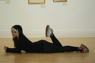
The photos we took in the practical during lesson time weren't really that successful, everyone was quite awkward and didn't really feel comfortable having their photos taken while posing. These 2 photos are examples of poses, a lying down 'glamorous' pose with the upwards pointing leg, and a natural standing pose.


Posing in a Location


Shooting on a location provided me with much more opportunities to take photos of different poses; objects such as the trees and the bandstand I used as props for my model, and managed to create different poses and a wider range of angles becuase I could work from countless varying heights. Also because the model was much more relaxed than when we did the photos in media, it was more comfortable for her, and we were able to work together and I could direct her towards what to do so as to achieve different things with each shot.

Thursday, 11 November 2010

Shutter Speed

Slow Shutter Speed gives the light time to be captured by the lens, so you can capture movement (such as the path of light.)


Fast Shutter Speed captures a single movement in a fraction of a second, which allows you to take a photo of a specific movement in a tiny part of a second- without it being blurry.


Wednesday, 10 November 2010

Skills Development

Skills Development on Photoshop

I have learned how to cut out images and layer them over a different background, I can also change the colours of an image (black and white/change the colour entirely/black and white out everything and leave one aspect in colour), I have also learned how to appy effects to images and distort them...
These will be useful when applied to my Unit 3 Production because I will be able to take 2 seperate images and cut out aspects from one of them and move them onto another, which makes it easier to make things stand out. Also the fact that I can change colours will be helpful because I'll be able to make things stand out even more by making an image black and white and keeping a focal point of colour on the most important aspects of the image.

I have cut out this image so that the background doesn't take your attention away from the can and flowers.


Buy turning the image tones of blue (or any other colour) I could easily adapt my image to fit in with any type of colour scheme that I wanted.

Buy applying an effect (note paper), i have changed the overall appearance of the image, therefore it can be used in lots of different ways and styles so I can diversify the ways in which it is used.


I need to develop further editing skills so that I can do more advanced things to my pictures which will set them aside from other images, by learning more about photoshop and how it works I will be able to produce more creative images that are more original and different.

Tuesday, 28 September 2010

Introduction Project

Photographic Storyboard:
Flat Plan, Rationale, Poster and Evaluation:


        Out of the skills on my “print skills audit”, the ones that I have used in this project are: Photoshop, text control, layers, opacity control, brightness and contrast control and cropping tool... I also have developed a better understanding of the Photoshop toolbar and all the effects that it has. I think that I have used these skills quite effectively, although my advert is quite basic I definitely have a better understanding of Photoshop and I think I will be able to improve on it in the future, the skills I used for my advert are effective for this particular product because I didn’t have to do anything particularly fancy- but I will have to do much more complex editing for other products/projects.
My work that I am blogging shows my skills development from practically no knowledge of Photoshop apart from getting rid of backgrounds and changing the brightness of a picture- to better use of the effects that it has, as I am able to now work with layers independently, individually change the colour/style/and opacity of text and also work with the photo adjustments such as posterise. I also discovered that you can change the effects of the text, so instead of it just being a solid colour and appearance you can make it look like it’s dissolving and merging into the background in other ways.
          The weaknesses in my work are the fact that my group and myself weren’t very organised because we didn’t plan effectively and didn’t have a clear idea about what we wanted to do, therefore our storyboard has had to be rushed because we also had some technical problems and it isn’t completed to the best it could be. To improve on these things I think that I should make sure that my planning is fully completed before doing any practical work and that I manage my time efficiently so that I don’t have to rush anything.
If I did this project again I would come up with more ideas for the photo for the advert/poster, then I would have more ideas to work with to get the best result possible; I would also fully organise beforehand, get models sorted and briefed and make sure that they knew what I expected of them to make the photo work.
          To move towards the standard achieved in professional working practice I think that I would need to have professional actors/models and also find the perfect setting for the shoot so that the whole picture was appropriate and related to the product and its audience. On top of that I also need to have more advanced Photoshop skills so that I can manipulate and edit the pictures to a much higher standard and do cleverer effects on them to make mine stand out from the rest.

          Before we re-branded our product its target audience was female OAP’s, generally from an Empty Nest background of a lower social grade (E), our new target audience was then female teenagers around the ages of 16-18. This massive age and fashion gap made re-branding very complicated because shaking the “old lady” feel about plastic rain caps was exceedingly difficult.
I think the editing and font of my project work towards engaging the audience’s attention because the colours are solid but in neutral shades which fits in with the current fashion colour scheme, and the fonts quirky... so it stands out from the normal “standard” fonts that are used everywhere (just an outline which is occasionally smudged almost as if it has been spray painted).  These elements work because they are targeted at young girls’ current interests and therefore are more likely to grab their attention because it is what they are specifically on the lookout for.
I don’t think that it has a clear enough message to it, what I really needed was a catchy slogan and better positioning of the “in stores near you” and the price because they don’t flow properly with the picture and draw attention away from the product itself and the product name.
If I could do my project again I would improve my skills and understanding of Photoshop, do a more detailed plan and come up with multiple ideas so that I had a range of poses/settings to choose from, and I would also come up with a good slogan or a memorable quote to go onto my poster.
          I think that my project does meet the demands of the target audience (although not perfectly), the colours of the poster aren’t gaudy and they fit in with the current seasons fashion platter (pastel shades) and also the actresses in the advert look pretty and fashionable, which always catches the eye of teenage girls who are conscious about their appearance, so if the product is portrayed as something that keeps you looking good (protect hair from rain), and you also look good while actually wearing, it, then the target audience will be more inclined to invest. But it’s also not exactly right for the target audience because it is quite a plain advert and there’s nothing exceptional that jumps out screaming “I’m different, I’m cool, you need me!”, so whereas it is relative to the target audience it’s not really an advert that they will be interested in unless the product is something that interests them and is strong within itself- therefore I think I could have done a little bit better and made it more interesting for the audience by really making it stand out from everything else.
          My work demonstrates my understanding of audience segmentation systems by the fact that I have taken into account the interests of teenage girls, such as the colour scheme which used soft feminine pastel colours, the different font of writing (not normal so it stands out), and the stylish models which also appeals to teenagers need to “look good”.  I think that I have taken into account the current demands of teenage girls and applied the relevant factors to my advert in a subtle way, and given that my planning wasn’t done on time I think that I have managed to achieve a pretty decent advert- and I think that it makes the plastic “granny” rain caps just that little bit cooler!